Alaraby Podcast, branding and UX design for an engaging audio platform.
Alaraby Podcast unifies audio content from Fadaat Media Group, including Alaraby Aljadeed, Alaraby TV, Syria TV and Ultrasawt, into one platform. This streamlined website simplifies access, making it easier for users to discover and enjoy diverse podcasts in a single, convenient location.
The logo features simple, clear typography, aligning with the Alaraby Aljadeed brand. Its design emphasises readability, ensuring consistency across platforms. Additionally, it incorporates a bold shifted shadow, reflecting the cassette-inspired identity we developed across the UX design, evoking the classic feel of an audio device.

Colour palette
SeCore’s Systems Comparison allows users to compare multiple systems results, enabling them to easily identify improvement opportunities.

Typography
We used ‘Readex Pro’ for its modern, clean design and excellent readability, ensuring a seamless user experience across all screen sizes.

Information architecture

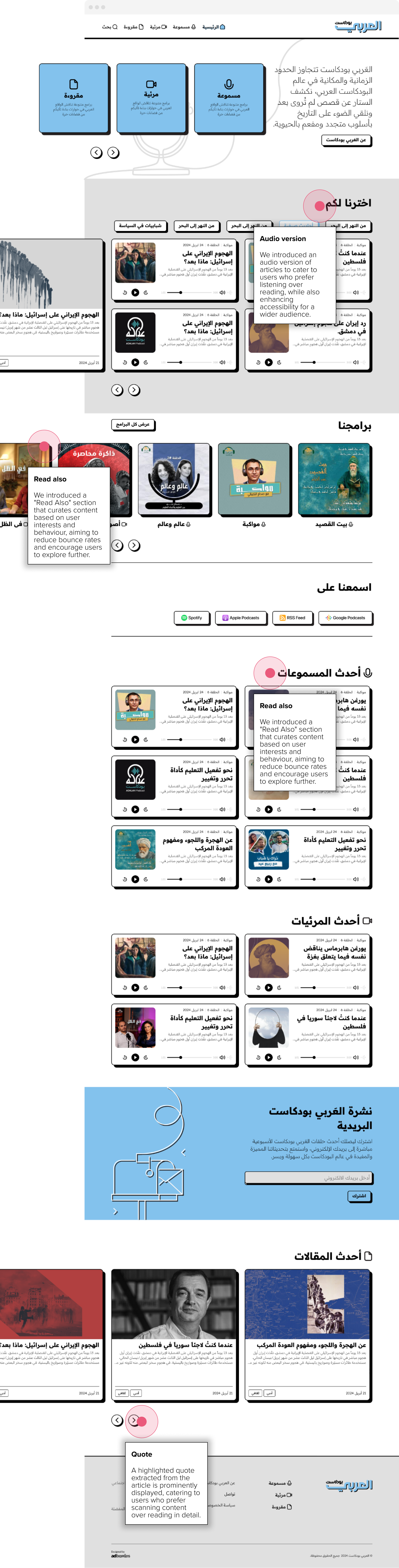
Homepage
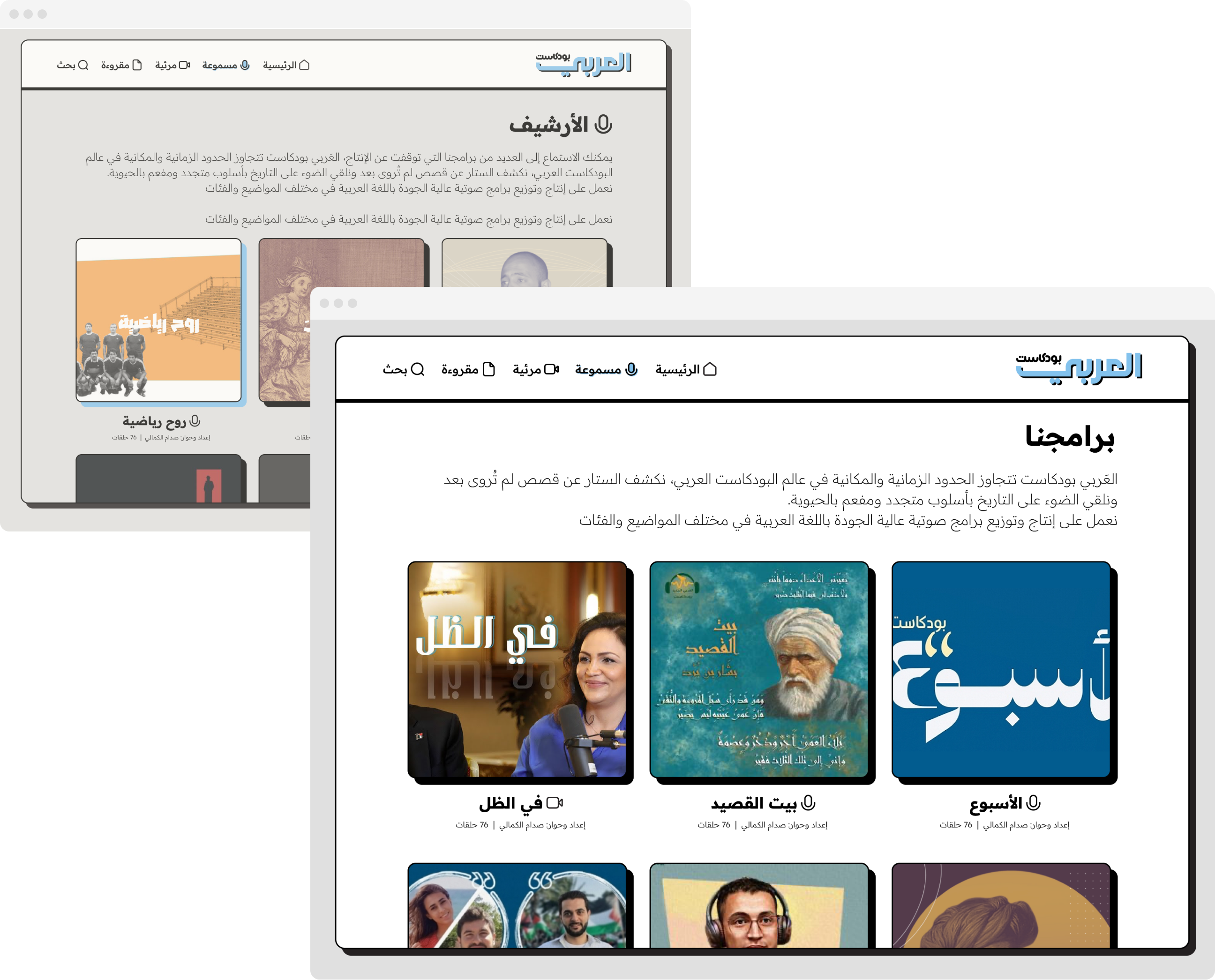
Program listing
The program listing page displays current programs at the top, with a separate section at the bottom for archived content, making it easy to explore both active and past episodes.
Program page
The program page displays a brief description, presenter details, and episodes sorted by the latest, offering users easy access to the program’s content.

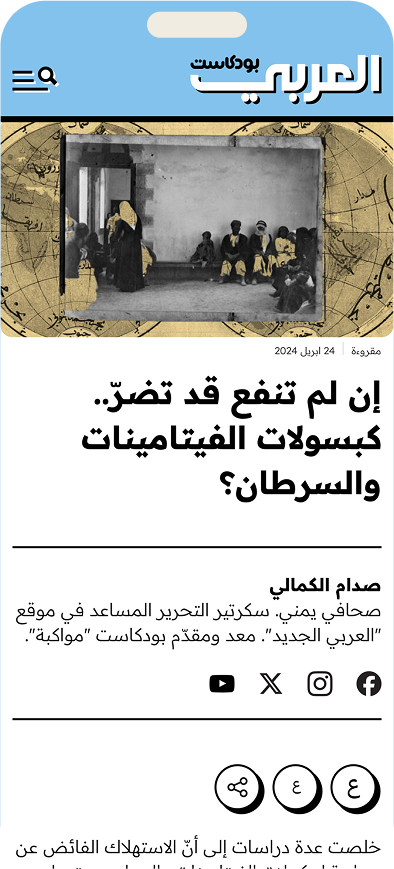
Episode page
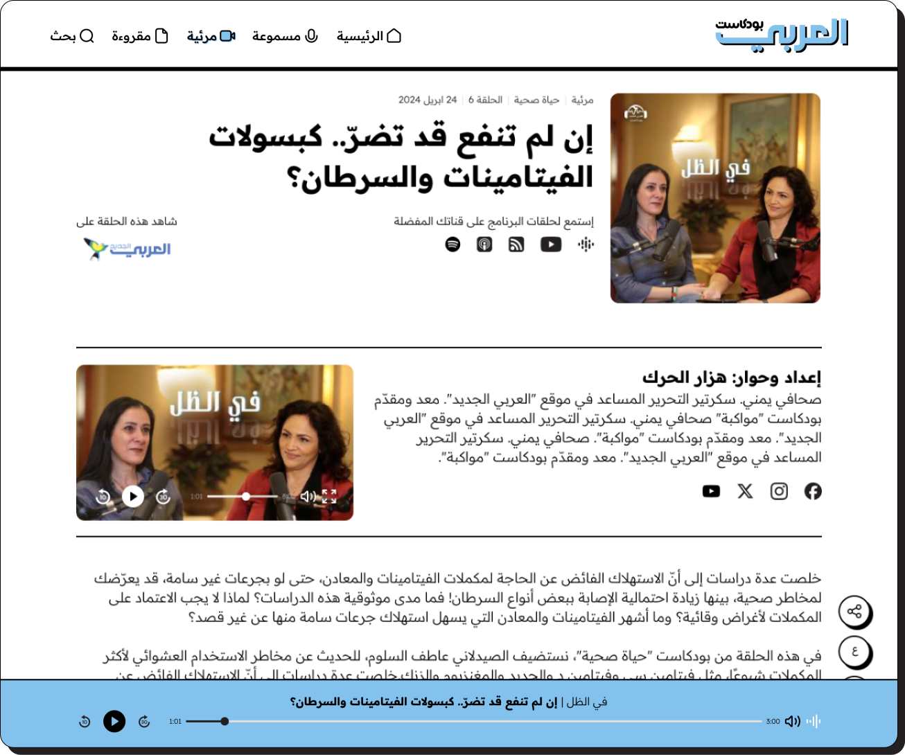
The episode page highlights the main audio content with a sticky player for uninterrupted listening, alongside an auto-generated text summary that enhances accessibility and provides quick insights into the episode.
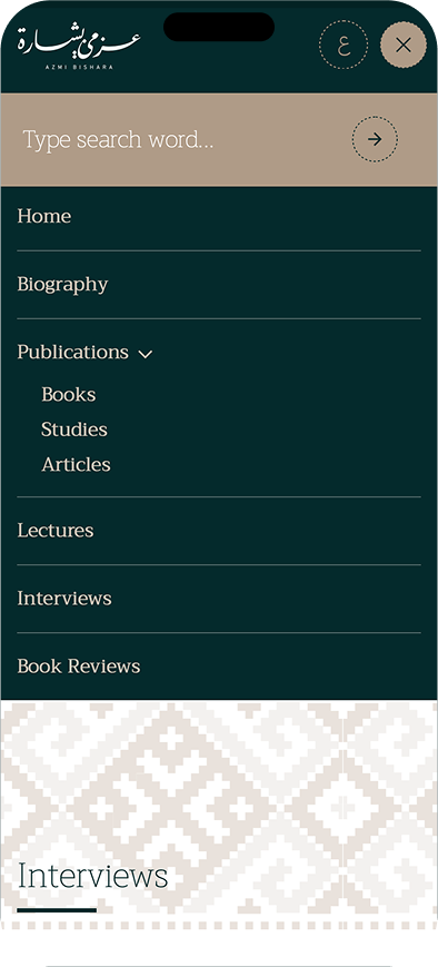
Responsive experience
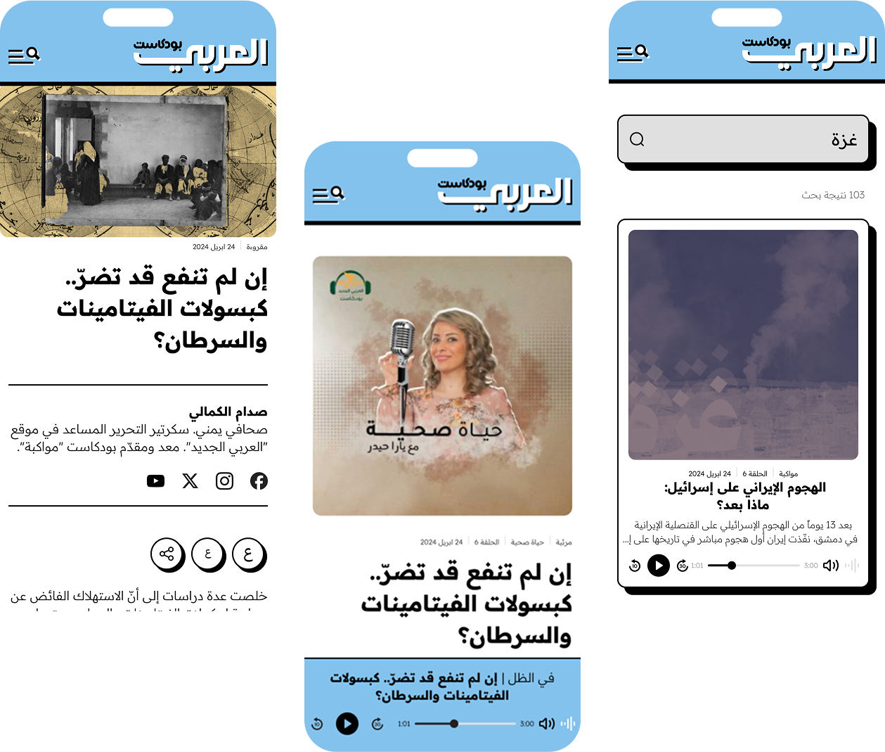
With 70% of existing users accessing the platform via mobile, we adopted a mobile-first approach to the design. However, the design is fully responsive, ensuring a seamless experience across all device sizes.
Responsive experience
With 70% of existing users accessing the platform via mobile, we adopted a mobile-first approach to the design. However, the design is fully responsive, ensuring a seamless experience across all device sizes.