Derived from the Somali word for “The African Horn” symbolises the Horn of Africa region.

The logo concept draws inspiration from this heritage, blending the region’s map with intricate patterns that celebrate its rich cultural identity.

Colour palette
Inspired by Africa, assigning each website category its own distinct hue for quick identification. This approach celebrates the region’s heritage while creating a cohesive, engaging multilingual experience.

Typography
We used ‘IBM Plex Sans Arabic’ for all three languages English, Arabic, and Somali ensuring a consistent and unified typographic style across the platform.

Graphic device
Expanding on the intricate pattern we crafted, we incorporated it as a graphic device to extend the brand identity across various elements, creating a cohesive and unified design.


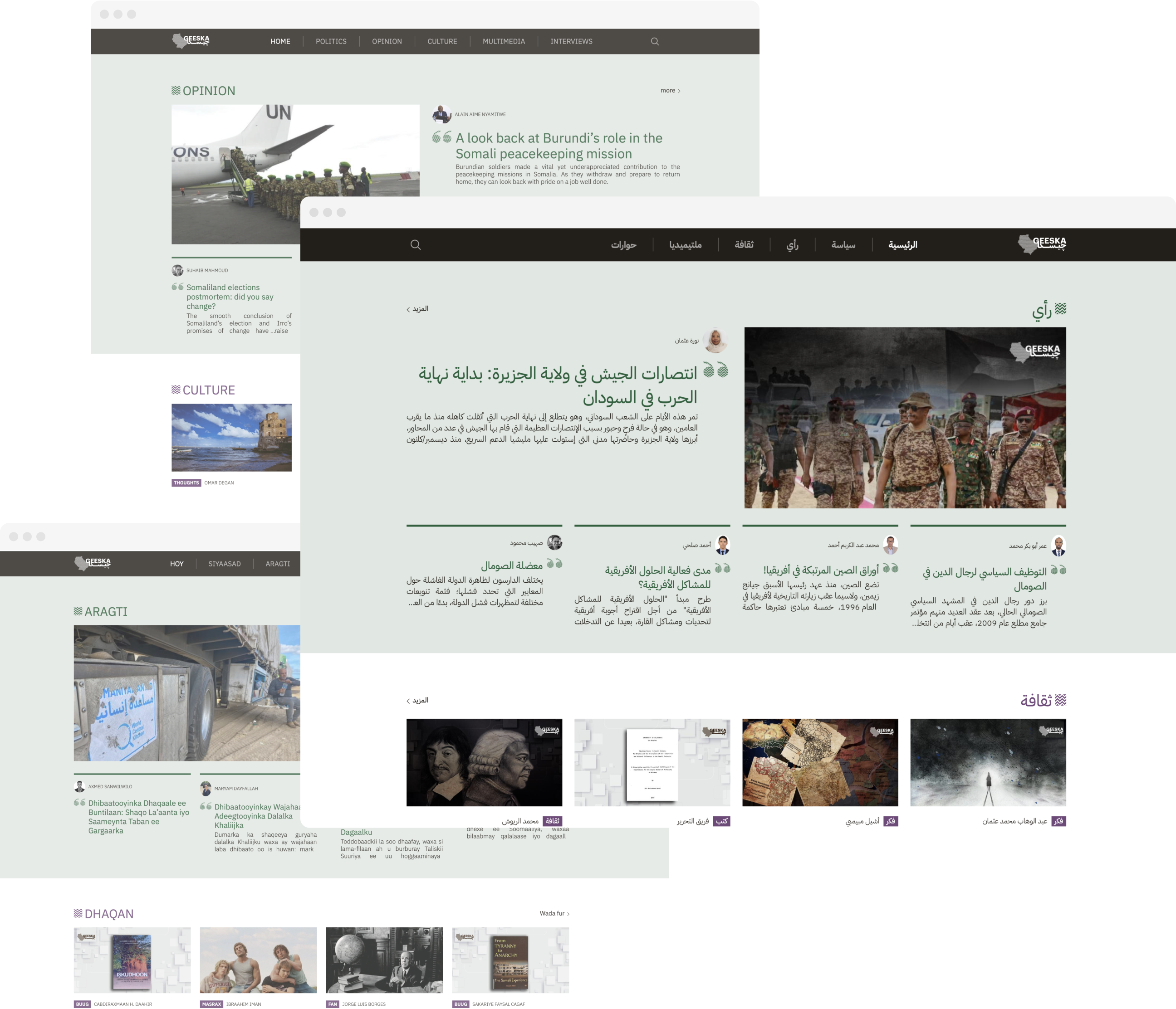
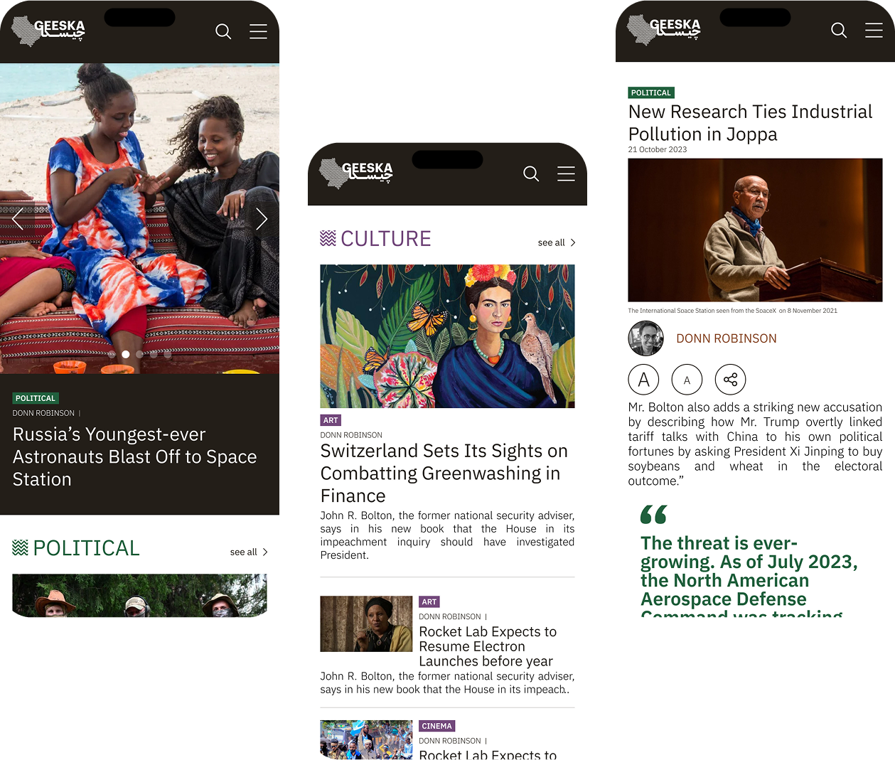
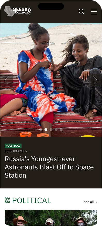
Homepage

Multilingual website
We designed Geeska’s UX to seamlessly accommodate English, Arabic, and Somali, fluidly transitioning between left-to-right and right-to-left layouts. By maintaining clear navigation and consistent visual cues, users can effortlessly switch languages without losing context, ensuring an inclusive experience for all audiences.
Design approach
Our UX design approach for Geeska centred on accessibility and inclusivity, balancing a clear, minimal layout with intuitive navigation for three languages. By conducting user research and iterative prototyping, we ensured each language retained consistent branding and design elements, creating a seamless experience for diverse audiences.
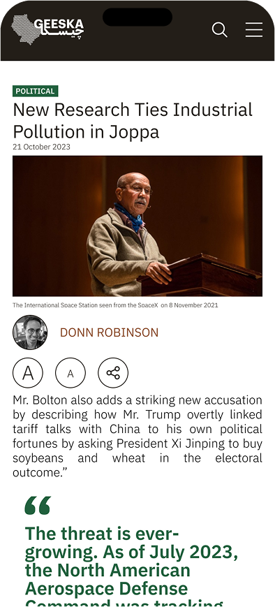
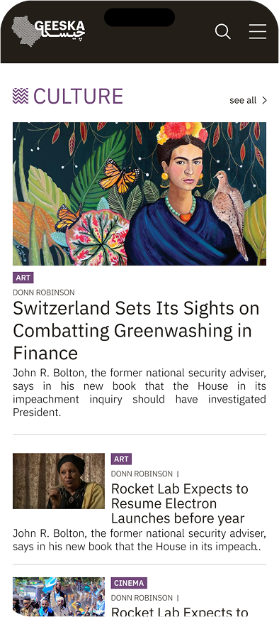
Responsive experience
A mobile-first approach, based on a conducted research over 70% of the potential audience accesses the platform via mobile.
Responsive experience
A mobile-first approach, based on a conducted research over 70% of the potential audience accesses the platform via mobile.
Development overview