Reflecting the fast-paced digital era, with the timeless essence of a traditional magazine rooted in thoughtfulness and reflection.

The logo combines Mega symbolising vast information, and Zine a global term for magazines. Built on bold typography, it aligns seamlessly with the parent brand identity Ultrasawt.

Imagery

Design approach
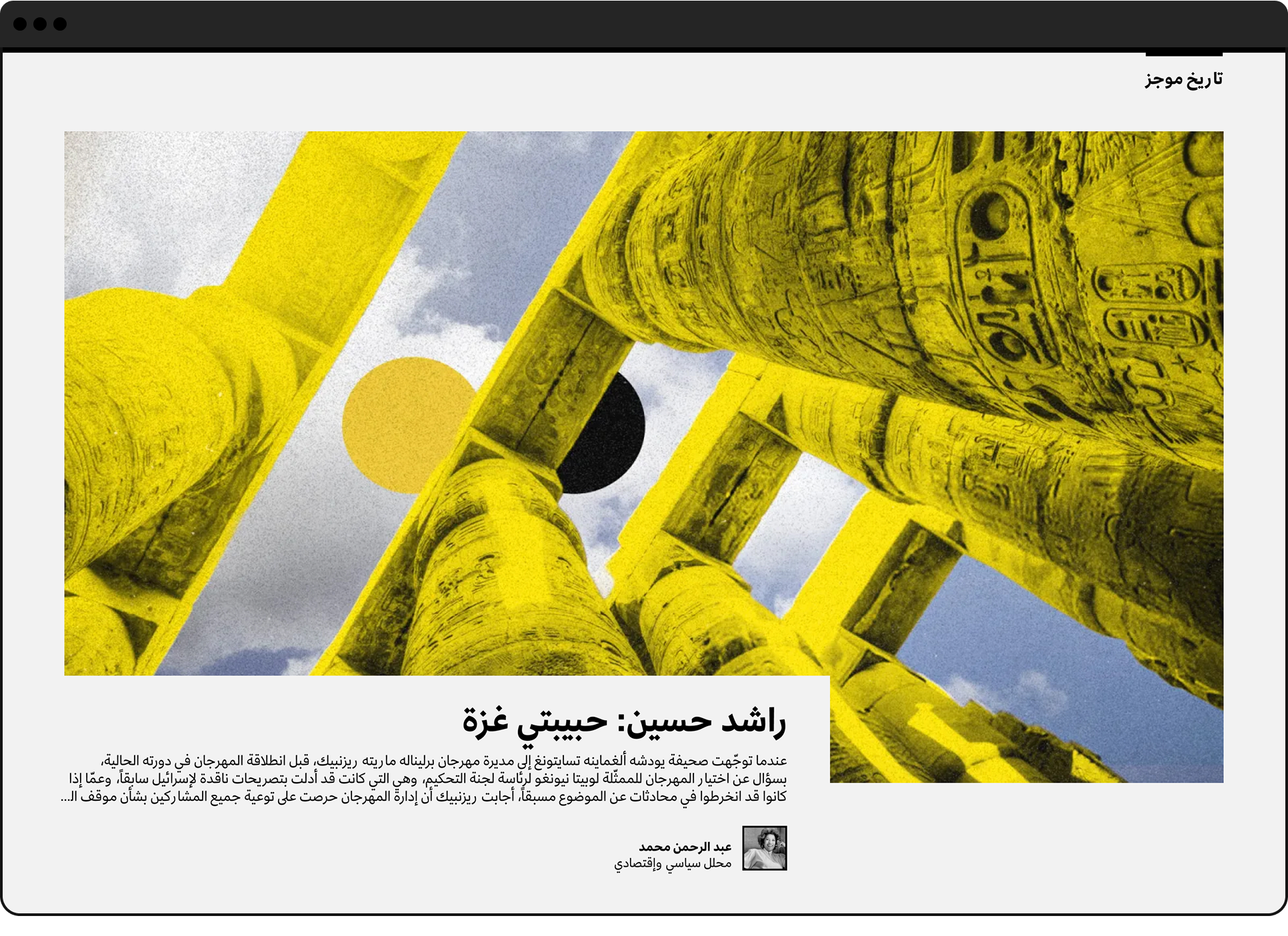
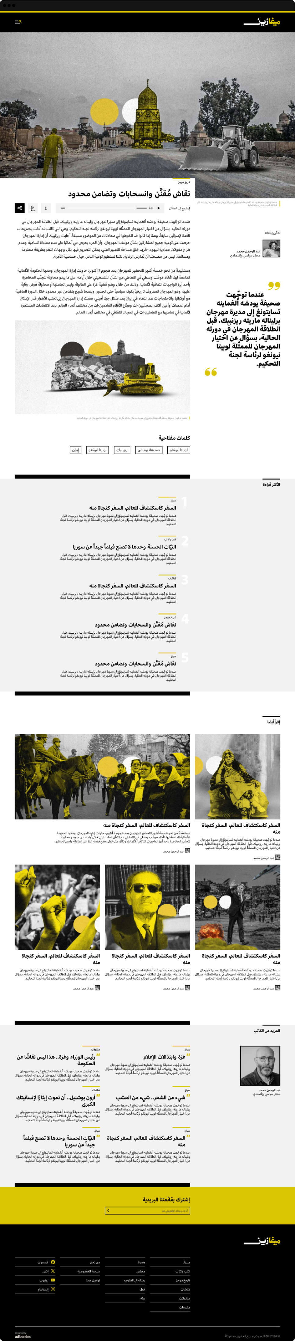
Our design approach for the digital magazine focuses on creating an immersive and visually engaging experience. We utilised large, high-quality images for cards to draw readers' attention and emphasise storytelling through visuals. This not only enhances the aesthetic appeal but also improves content discoverability and ensures a modern, magazine-like feel tailored for digital platforms. The use of bold imagery is optimised for all devices, offering a cohesive and captivating experience across screens.
Editors

Do titles reflect stories?
Yes, titles reflect stories, but research shows that users engage more with content when a quote or excerpt from the story is displayed instead of just the title. To mirror the concept of a magazine cover in print, we introduced a quote that aligns with two secondary titles under the main story title, creating a visual representation similar to a magazine cover page.

Article page
Responsive experience
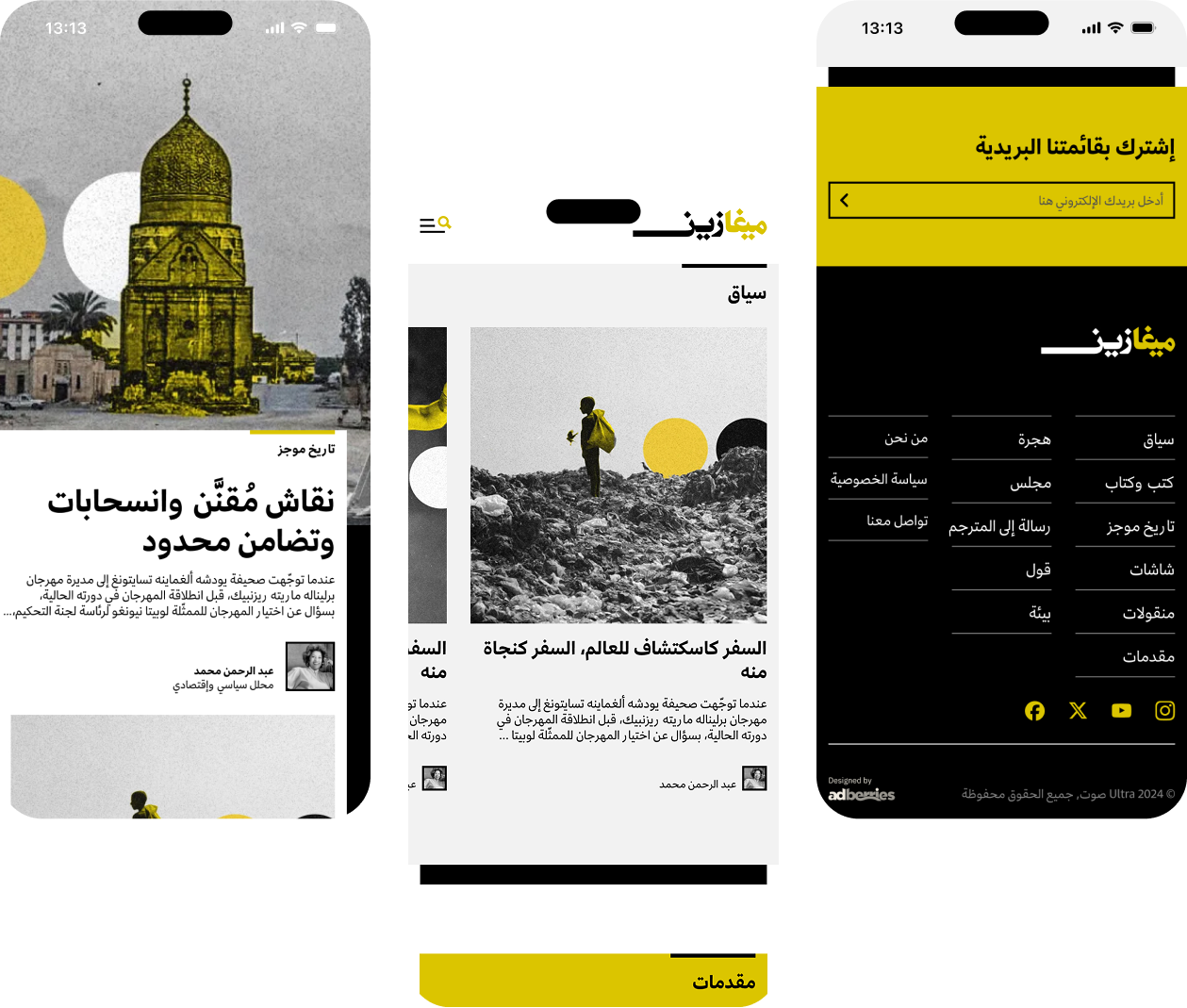
With 70% of existing users accessing the platform via mobile, we adopted a mobile-first approach to the design. However, the design is fully responsive, ensuring a seamless experience across all device sizes.
Responsive experience
With 70% of existing users accessing the platform via mobile, we adopted a mobile-first approach to the design. However, the design is fully responsive, ensuring a seamless experience across all device sizes.


