UltraSawt,complete rebranding & UX design of a portal and six associated news outlet websites
Creating a cohesive brand identity that accurately represents the main portal while maintaining consistency across six associated news outlets and a distinctive magazine.

The logo was designed by combining and harmonizing the initial letter "U" from the English word Ultra with the Arabic letter "ص" from the word صوت (meaning "sound").
The six news outlets logos align with the main logo's design harmony and are created by incorporating the news outlet names into the primary logo.

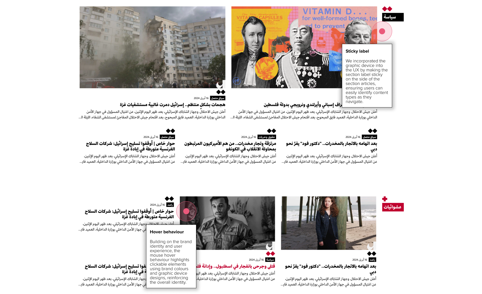
Graphic device

UI KIT
We developed a comprehensive UI kit for each website, serving as a centralised library of design components, styles, and guidelines. This kit streamlines the development process, ensuring consistency and efficiency across all platforms.

outlets
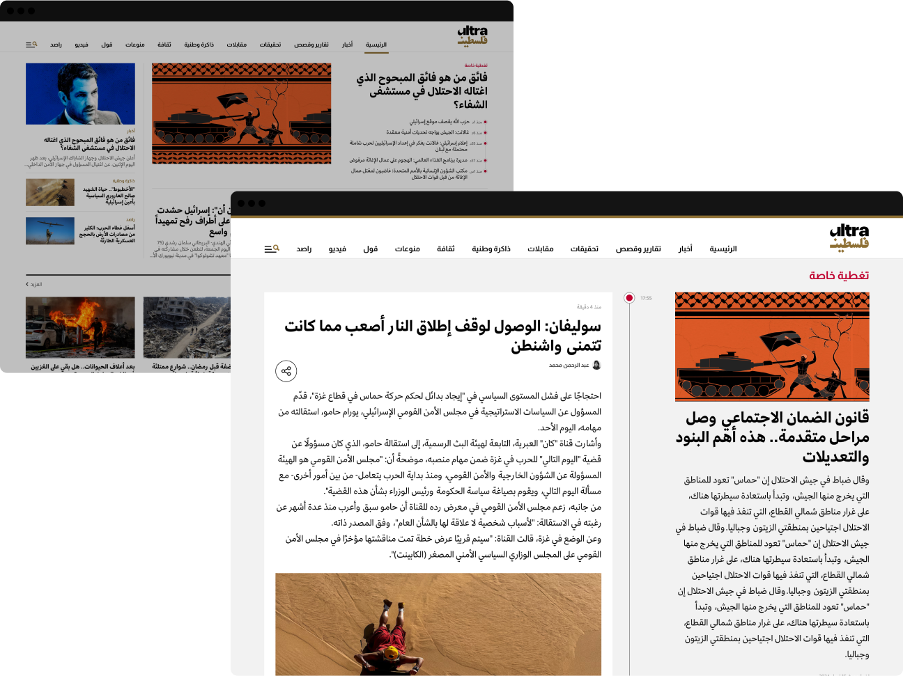
News timeline
We designed a timeline feature for the news outlet websites' homepages, allowing editors to post time-specific updates related to a particular story or trending topic. Additionally, we created a dedicated story section where users can explore the full timeline, viewing all detailed updates for that specific story.
Discover outlets
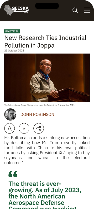
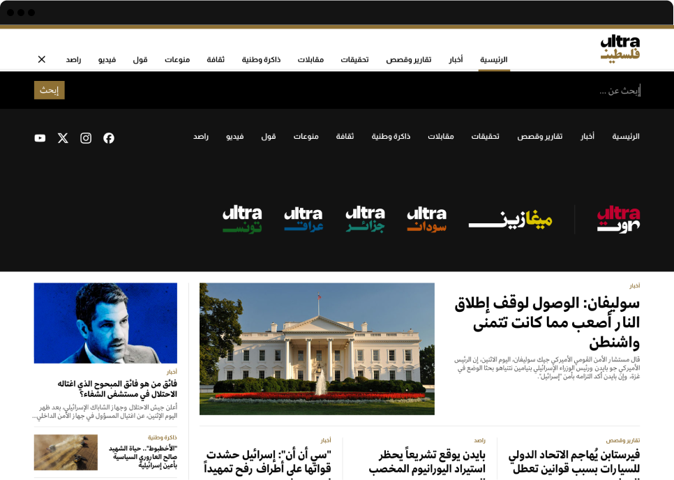
Each outlet features unique colours that are closely tied to its brand, allowing users to easily identify content. This ensures clarity, even though the user experience across all websites remains consistent, preventing confusion and overwhelm.
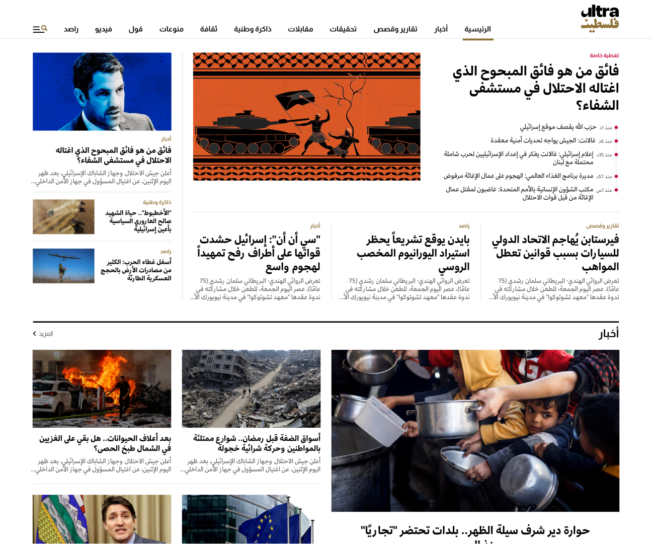
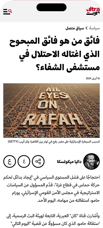
Article page
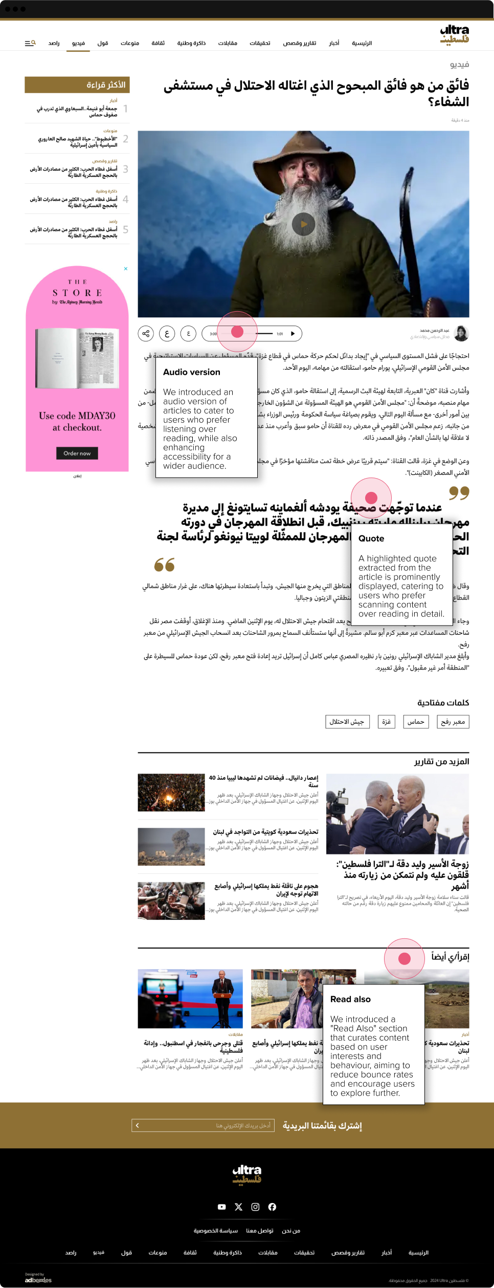
Responsive experience
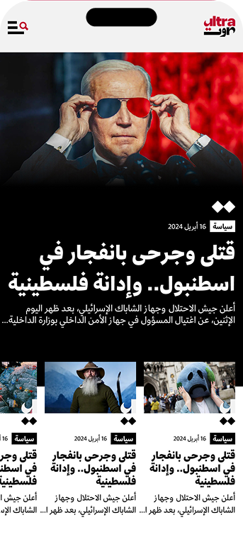
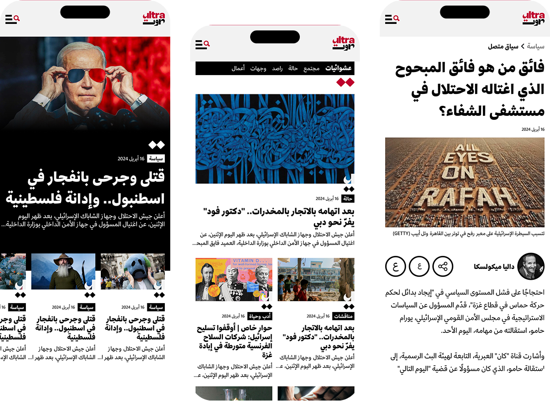
With 70% of existing users accessing the platform via mobile, we adopted a mobile-first approach to the design. However, the design is fully responsive, ensuring a seamless experience across all device sizes.
Responsive experience
With 70% of existing users accessing the platform via mobile, we adopted a mobile-first approach to the design. However, the design is fully responsive, ensuring a seamless experience across all device sizes.