Qatar Investment Authority
Qatar Investment Authority (QIA) is the sovereign wealth fund of the State of Qatar.
Our dedicated team embarked on a remarkable journey to revamp the QIA website. Our objective was clear: to showcase the immense scale and significance of the QIA, repositioning them as a standout player in the global market. With a keen focus on attracting targeted personas and fostering lead generation, our redesigned website serves as a powerful gateway to success.
User Focused
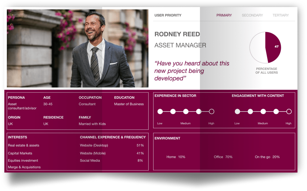
Collaborating closely with the QIA team, we delved deep into the world of their target audience groups, meticulously studying their journeys and prioritizing their valuable tasks and goals. Armed with extensive research studies and a keen understanding of the QIA's objectives, we crafted compelling personas and mapped out key user journeys, ensuring an exceptional user experience at every touchpoint.

Research Based
Through a comprehensive research study that included qualitative and quantitative analysis, engaging stakeholders and users, we gained valuable insights to shape an intuitive information architecture for the QIA website.

Ideation & Prototype
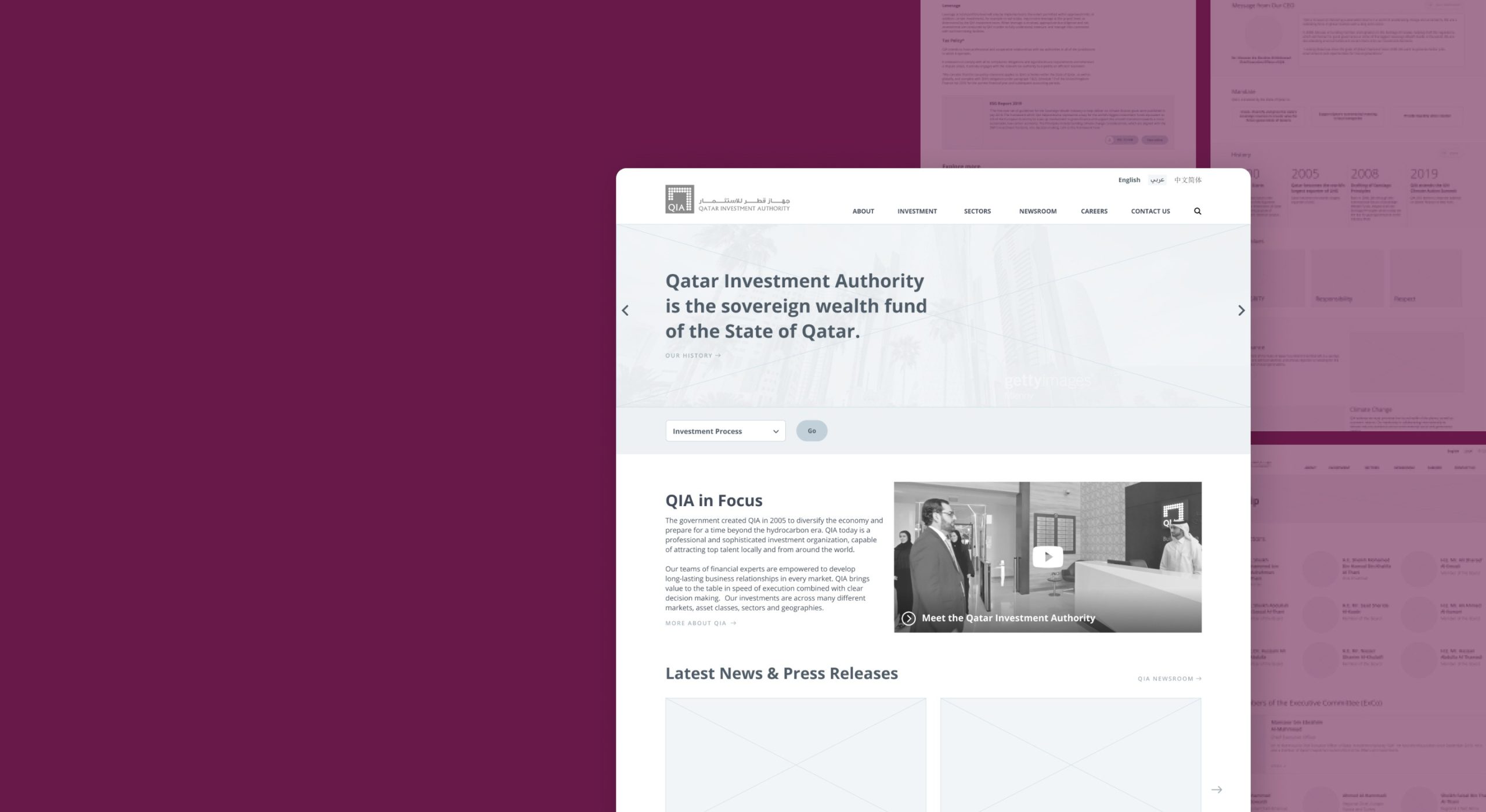
With the information architecture in place, our team proceeded to design wireframes that captured the visual representation and arrangement of all elements on the screen, ensuring a cohesive and user-friendly interface.

Website Design
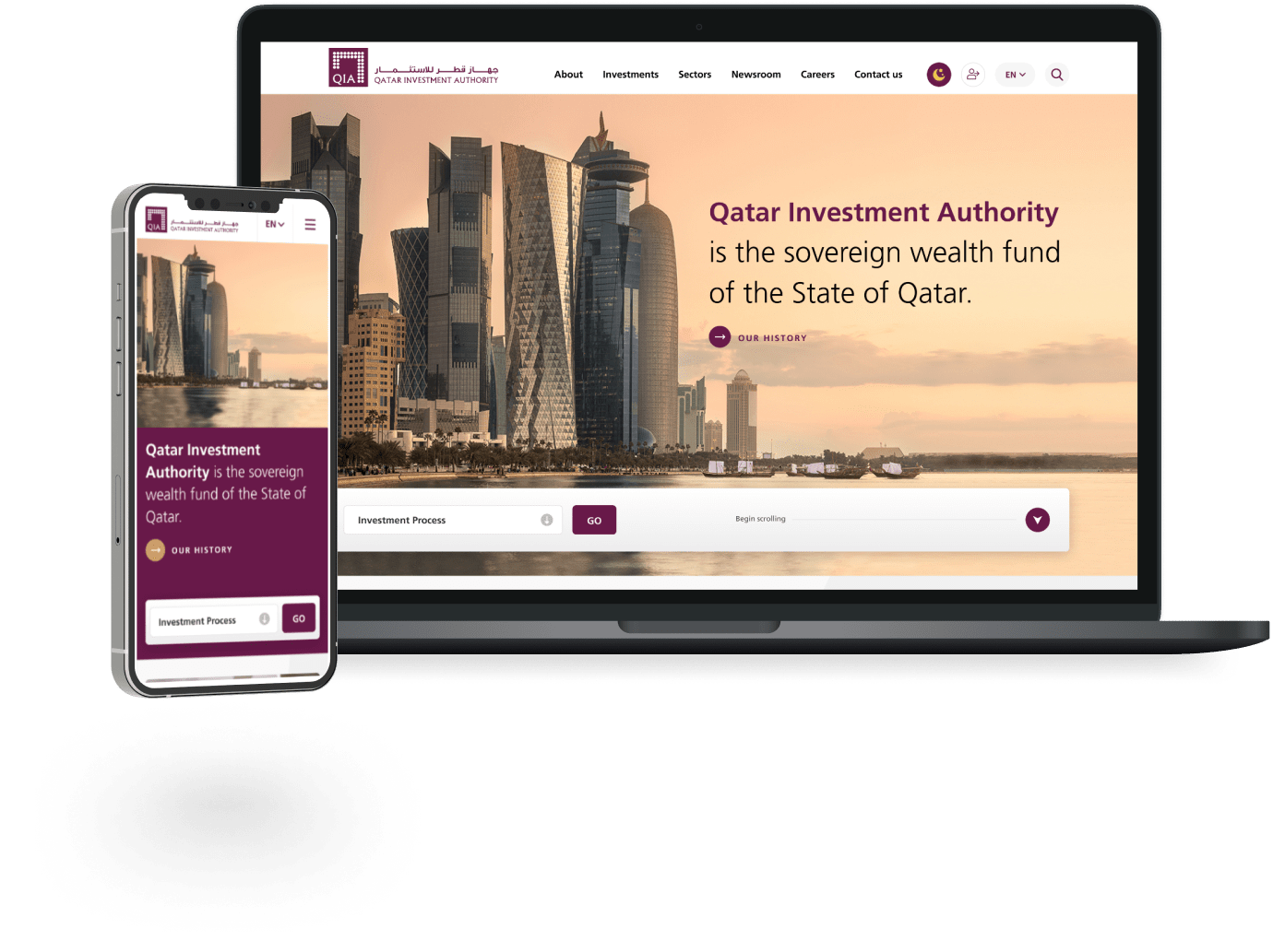
Our final design for the QIA website showcases a clean and modern aesthetic, featuring a user-friendly interface and streamlined navigation. With its responsive design, the website seamlessly adapts to different screen sizes, providing a consistent and enjoyable user experience on both mobile and desktop devices.

Dark Mode
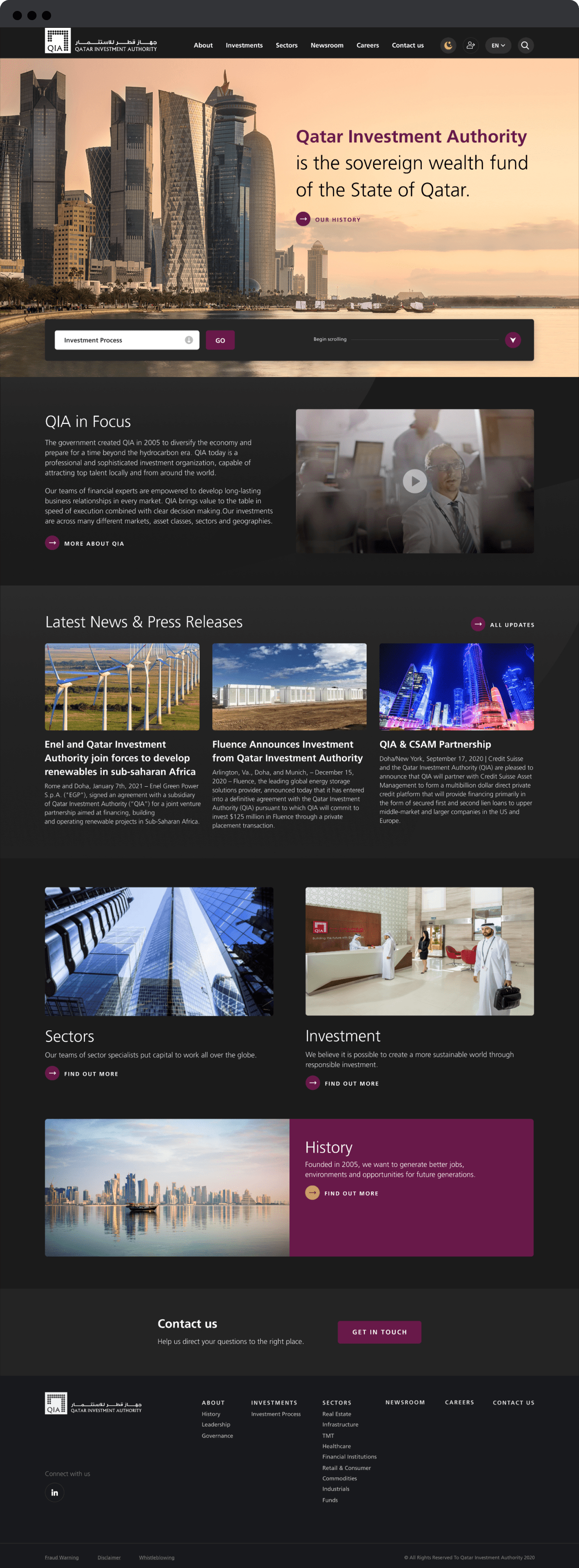
Recognizing the increasing prevalence of screen usage and its impact on eye strain and sleep patterns, we prioritized user experience and accessibility by incorporating a Dark mode feature into the new QIA website. This alternative viewing option mitigates the discomfort caused by prolonged exposure to bright blue screens and helps support users who are sensitive to eye strain. By reducing the emission of stimulating light and promoting a more restful viewing experience, Dark mode enhances usability and promotes a healthier digital experience.
